Unco Frank’s Hawaiian BBQ
Case Study
Website Redesign
Redesigning a responsive restaurant website
PROJECT OVERVIEW
Unco Frank's, a Bay Area restaurant, underwent a brand refresh and needed to update its website entirely in order to boost website traffic and increase sales.
CLIENT’S NEEDS
After implementing a brand refresh, Unco Frank's, a Bay Area restaurant, identified the need to completely revamp its website to effectively enhance online visibility and drive sales growth.
Unco Frank's, a fast-casual Hawaiian BBQ restaurant, has been serving the Bay Area for three years. Recently, Frank, the restaurant owner, decided it was time to refresh the brand. He collaborated with a friend who owns a graphic design agency to develop Unco Frank's new branding. The original website, created on Squarespace by Frank's friends, needed an update. I became involved when Frank was ready to unveil the new branding and required a website redesign.
While Unco Frank's has maintained solid business over the past few years, Frank aims for continual growth. Currently operating within a wine bar, his vision extends to establishing his own brick-and-mortar establishment, possibly in multiple locations. The objective of the website redesign is to enhance Unco Frank's online presence, driving both virtual engagement and physical foot traffic to the restaurant.
UNCO FRANK’S WEBSITE PRIOR TO BRANDING AND WEBSITE REDESIGN:
RESEARCH
While Frank's website was typical for a restaurant, I aimed to reassess certain aspects of the information architecture to enhance the user experience and potentially boost sales upon landing on his page.
OBJECTIVES
Understand user mental models regarding the layout of a restaurant’s website
What elements in the website layout motivate users to convert into customers
METHODS
Competitor Analysis
Survey
One challenge I encountered during this research was securing an adequate number of participants for user interviews or card sort within the allotted time frame. Since assembling a substantial group proved difficult, and considering the straightforward nature of the subject matter conducive to remote data collection, I opted to distribute a survey across various platforms as the next viable option, along with competitor analysis.
COMPETITOR ANALYSIS
USER SURVEYS
I conducted two surveys. The initial survey focused on people's expectations regarding restaurant websites and factors influencing their purchase decisions. The second survey expanded on the first, delving into specific aspects of each website section.
I decided to conduct a second survey to gain further clarity on certain aspects of the website's information architecture. While some considerations regarding a restaurant's website might seem evident to someone who regularly explores new dining options, I wanted to ensure that my decisions were data-driven and validated, rather than relying solely on intuition.
SURVEY FINDINGS
Top items users typically look for when visiting a restaurant’s website:
Menu and pricing (100%)
Online ordering and delivery (75%)
Hours of operation and other contact info (62.5%)
Restaurant bio (62.5%)
Items users typically look for on a menu page:
High quality images of menu items (60%)
Buttons/links to order food (60%)
Ingredients used (50%)
Dietary restrictions (40%)
UNCO FRANK’S WEBSITE ANALYSIS
Frank's website setup was fairly standard, covering about 90% of the elements validated by users in the survey. This included his menu, online ordering, easily visible restaurant information, and biography.
AREAS OF IMPROVEMENT
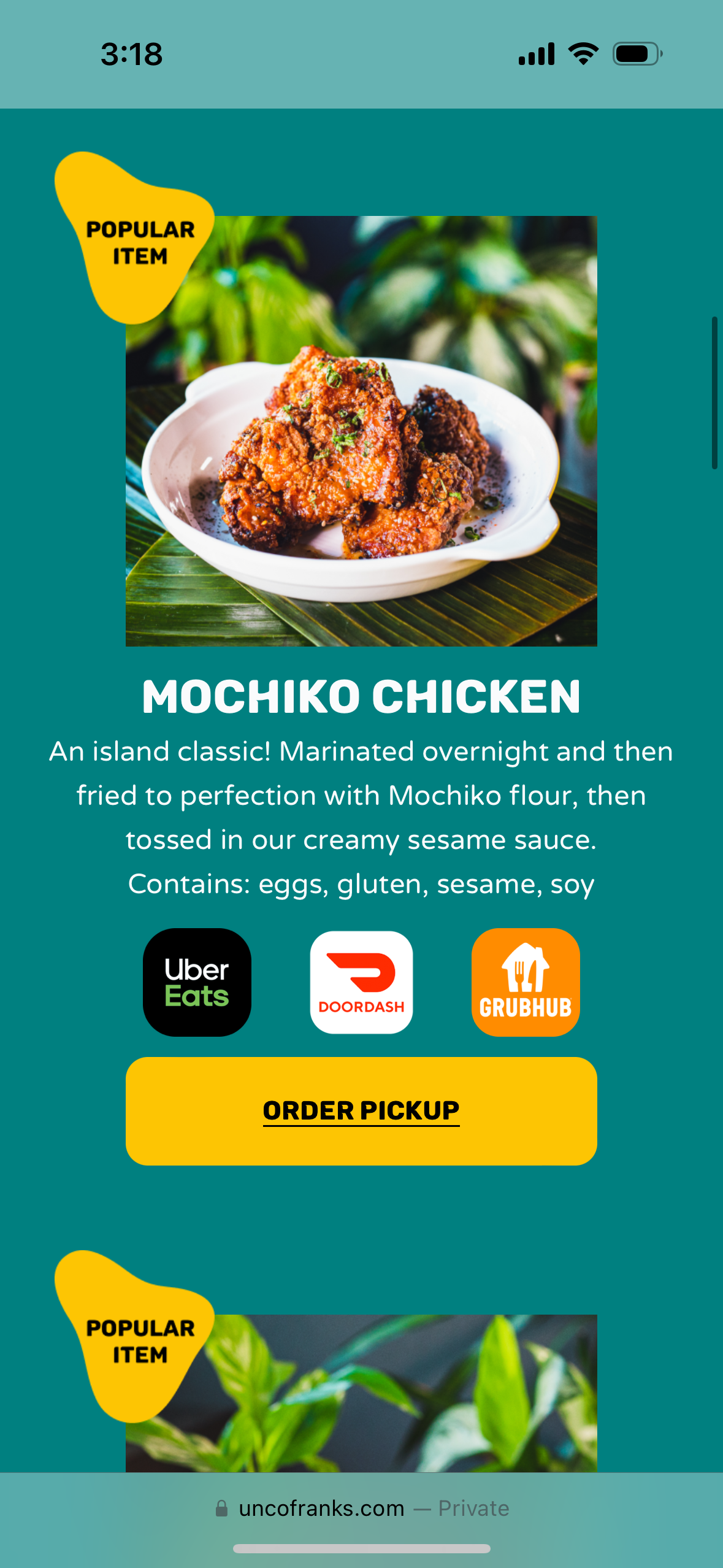
Online Ordering: Online ordering options are limited to specific areas of the website, besides the navigation bar. Frank's uses multiple online delivery platforms (I.e. UberEats, Grubhub, and Doordash) to enhance visibility.
Menu: The current menu lacks ingredient information. Adding this detail could enhance user experience.
Overall Aesthetics: With the creation of a new branding guide, incorporating colors, fonts, and images to reflect the new brand identity is essential.
Squarespace Limitations: Having familiarity with Squarespace through my portfolio, I recognize certain design limitations inherent in the platform, which my client also uses for web hosting. Consequently, there might be specific features we wish to incorporate into the design that could encounter implementation challenges or require creative workarounds.
INFORMATION ARCHITECTURE
BRAND GUIDE REFRESH
Here's the refreshed brand guide commissioned by my client. It represents a significant departure from the previous bright color theme, adopting a deeper, more mature aesthetic. While still incorporating bright highlights in select areas to maintain a sense of fun, it overall exudes a more refined appearance.
LOW-FIDELITY WIREFRAMES
HIGH-FIDELITY WIREFRAMES
FINAL DESIGN
ORDER PLATFORM OPTIONS
Designing in Squarespace has limitations compared to Figma. For example, I couldn't consolidate all ordering platforms into one button as I originally intended. On desktop, users can hover over menu images to choose their platform, while on mobile, buttons are placed under each image.
INSTAGRAM GRID
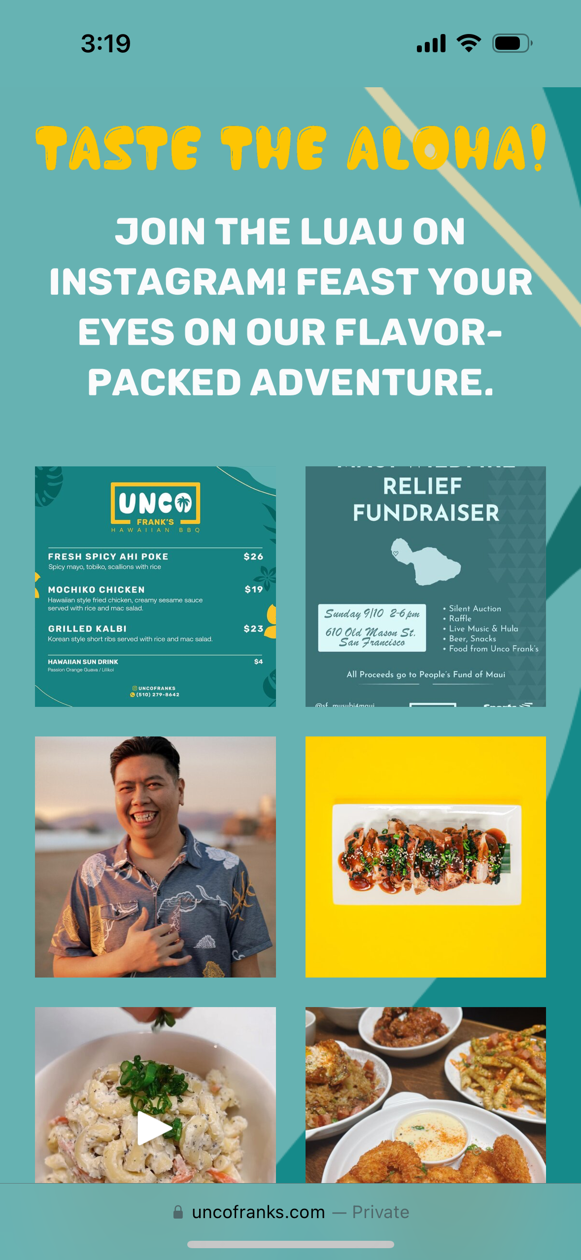
Despite Squarespace's design constraints, I managed to integrate certain features seamlessly. One such addition was incorporating my client's Instagram grid onto the homepage, aiming to enhance web visibility and attract new social media followers.
CATERING ORDER FORM
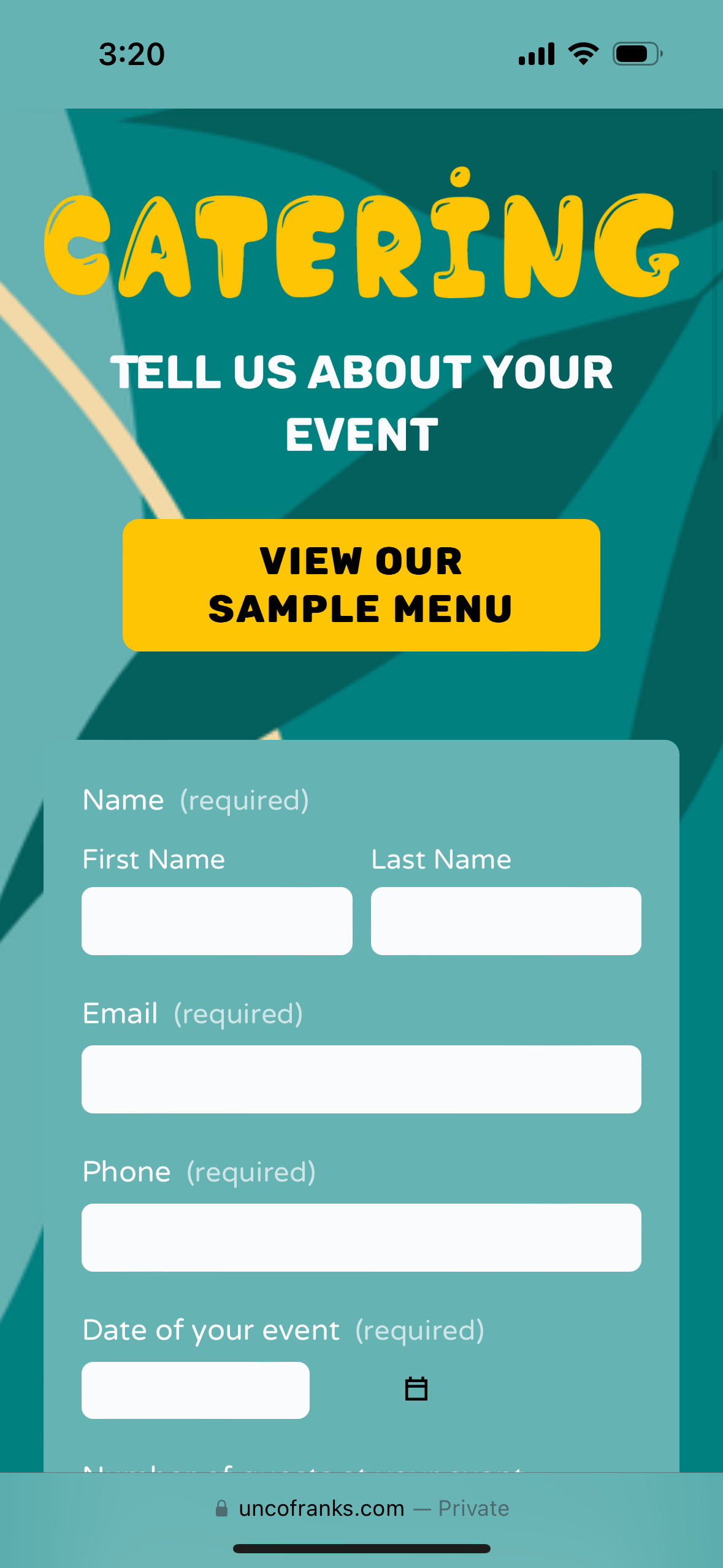
In the previous design, users accessed my client's catering order form by clicking a button on the Catering page. To streamline the process and eliminate the need for an extra click, I embedded the form directly onto the catering page for seamless access.
MOBILE PREVIEW
DESKTOP PREVIEW


